Edit: Related reading
"How the web became unreadable"
I would have been one of the complainers, and it's one topic I forgot to raise with the team when I met them at Kscope.
Use of APEX 5 is ramping up at my current site and I couldn't go any further without having a little play. A while ago I used some filters in my ad blocker extension to trim the fat from the OTN forums pages.
I'm come across an even better Chrome extension since then called Stylebot and now it's really easy to manipulate pages you regularly visit.
If you like having a secondary browser for development, you can use Stylish for Firefox.
For instance, when you open the extension you can nominate elements on the page then declaratively define some attributes to use every time that page loads on the specified site.
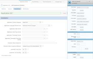 |
| Stylebot interface |
Modified on the left, original on the right.
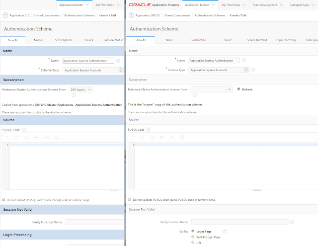 |
| Shared component properties |
I did the same thing for the Shared Components home page, though this UI will also be revamped like the page designer at some point in the future
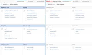 |
| Shared Components |
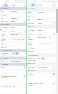 |
| Page Designer properties |
People have already asked for me to post my tweaks, and it turns out Stylebot allows you to share them so here is mine:
Oracle APEX 5 fitted with 4.2 contrast
This also works no worries with 18.2, and 19.x. Using dark mode in 19.2 will need a different set of CSS, though adjustments I made for the green motif in 20.1 seem to cover both light & dark.
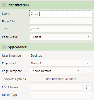 |
| APEX 20.1 |
No doubt I'll make adjustments in future as I explore the environment and see what works, I'll be sure to keep it up to date. I'm happy to hear suggestions, and perhaps news from the APEX development team that they're thinking of adding built-in styling options to the development environment, kind of like skins.
For completion, here are the styles I used so far.
@import url(http://fonts.googleapis.com/css?family=Georgia);

/* Component properties */
.a-Body .a-Main div.a-Region-header {
    background-color: #cfdef0;
    border-style: none;
    border-width: 1px;
    border-color: rgb(170, 170, 170);
}

.a-Body .a-Main h2.a-Region-title {
    font-weight: bold;
    font-family: Helvetica;
    font-size: 14px;
}

/* Shared components */
.a-Body .a-Main span.a-LinksList-label {
    font-size: 14px;
}

.a-Body .a-Main label.a-Form-label {
    font-size: 13px;
}

.a-Body .a-Main li.apex-rds-item.apex-rds-after a span {
    font-size: 13px;
}

.a-Body .a-Main li.apex-rds-item.apex-rds-first.apex-rds-selected.apex-rds-item--hint a span {
    font-size: 13px;
}

/* Frame some buttons */
.apex-page-designer div.a-Region-headerItems--buttons button {
    border-style: solid;
    border-width: 1px;
    border-color: #949494;
}

.apex-page-designer button.a-Button {
    border-width: 1px;
    border-style: none;
    border-color: #949494;
}

/* Page designer properties */

.apex-page-designer div.a-PropertyEditor-propertyGroup-header {
    background-color: #cfdef0;
}

/* Component view */
#ContentBody div.aRegionHeading {
    background-color: #e8e8e8;
}

#ContentBody div.aRegionHeading h1 {
    font-weight: bold;
}

#ContentBody tr td a
,#ContentBody tbody tr td {
    font-size: 13px;
}


/* Emphasise disabled buttons */

.apex-page-designer div button.a-Button:disabled {
    color: #d6d6d6;
}

/* Substitution string width */
#BB input[id^="SUBSTITUTION_VALUE"]
,#BB input[id^="SVAL"]{
    width: 500px;
}

/* apex 5 */
input[id^="SUBSTITUTION_STRING"]
,input[id^="SSTRING"]
{
    /*max-width: 300px ;*/
    text-align: right;
}

/* Hover designer buttons */
button.a-Button.a-Button--goToPageButton.a-Button--pillEnd:hover
,button.a-Button.a-Button--noLabel.a-Button:hover {
    background-color: #d0e4fa;
}

/* Search box */
.a-SearchBox--autoExpand .a-SearchBox-input {
    width: 170px;
    background-color: #ffffff;
}

/* Success window */
#pdNotification {left: 40px;}

/* Make locked pages stand out more in page list */
#apex_pages_irr span.a-Icon.icon-lock {
    color: #ff0000;
}
/* Widen 5.1 scrollbars */
.u-ScrollingViewport::-webkit-scrollbar{
    width: 13px ;
}

/* Hide those darn tooltips
   18.x undo now comes under this, but I can't specify just the PD tooltips
#a_PageDesigner .ui-tooltip {display:none;}]
*/
You may also be interested in Filip's XPlug extension to further tweak the Page Designer.See a video describing how this is done here.
Happy APEXing!


6 comments:
I created a Bitbucket snippet with your forum code. This URL can be added as a custom external filter to Adblock Plus or uBlock.
https://api.bitbucket.org/2.0/snippets/jhult/KA55z/files/oracle_forum_ad_block_filter.txt
Thanks for the tip on Stylebot. I had not heard of it. In the past, I've used a combination of user scripts and ad block filters.
Cool, thanks for that. We all learn something ;p
They should just add Theme Roller to APEX builder. :)
I'm sure it's as simple as "just" adding it ;p
Great Post.
I also find the current look-and-feel of APEX 5 too light and too less contrast.
But I am a Firefox user. Not Chrome.
In order to use your CSS in firefox I use the extension Stylish.
Thanks.
Thanks for the reference regarding Firefox. I've started to use it again as a secondary session for development.
Post a Comment